Forging the Edge for
VR Martial Combat
Development Studio -Schell Games
Internal IP
UX Designer / UI Developer
8 Months
Project Highlights
What I Did
UX Design
UX Prototyping and Testing
User Interface Development
Inclusivity Advocacy
Player Testing and Feedback
Key Takeaways
User Interfaces in VR Applications
User Testing & Iteration Cycles
Accessibility and Inclusivity in VR
Cognitive Overload in VR
Outcome
Early Access Release 2019
Full Releases 2020
PC, Oculus Quest, and PSVR
Overwhelmingly Positive Reviews
Excellence in User Interface Design
Wake Up, Champion...
An obvious application for VR is to capture high fantasy adventure in a world of swords and sorcery. Obvious because a slew of titles focusing on fantasy melee combat had hit the VR market and gained massive popularity. But many of these products were open ended sandbox toys featuring very little story or meaningful player progression.
We saw it as a prime opportunity to try our hand at VR swordsmanship and build a title that would offer our players a campaign of war rather than just single pitched battles. We wanted to bring depth and drama to VR swordplay.
The Game
Fight. Fall. Rise Again.
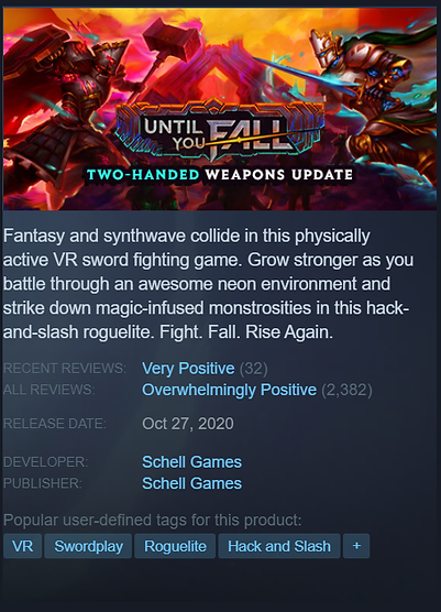
Until You Fall was a recursive Roguelite VR experience where the player threw themselves at a gauntlet of enemy combatants. Death was certain, but each death was an opportunity to rise again stronger. Its core differentiator was our unique VR Parry Combat system with RPG stats to foster a sense of skill mastery and quantifiable player progression.
Until You Fall Main Details
-
PC VR, Oculus Quest
-
Single Player
-
Traditional Roguelite RPG
-
Unique Melee Combat Mechanics
-
Story Rich Evolving World
The Challenge
UI and UX in VR was a brand new subject to our studio. Theory and findings were shared across the industry but putting these to practice would take some time. We needed a foundational understanding of how UI can best be deployed in VR before we would be able to properly support this new experimental combat game.
From a player perspective, VR melee combat is physically demanding and an intense sensory experience. The physicality of the game and the primal threat of an enemy assaulting you in VR triggers an instinctive stress. These stress levels are uniquely potent in VR, making players easily overwhelmed, disoriented, and exhausted. We had to take this into account for nearly every combat messaging system.

The Strategy
Until You Fall's pitch was more complexity and deeper mechanics in VR combat. We needed to strike a balance with the reality that our VR players would be under stress and not likely able to think critically or observe carefully during intense combat moments.
We would start small and look for design solutions that communicated important combat information in an intuitive but nonintrusive way. Combat information had to be reliably digestible at a glance to be useful to the player in the game's pacing.
Above all, we were trying to never be 'in the way' of the action. Being distracting or intrusive would harm our sale of an immersive fantasy melee in VR.

How exactly would UI work in VR?
To answer this open question the UX Discovery phase of the project entailed ideating, prototyping, and testing different strategies that we could employ for a VR HUD. Informed by the design specs the Combat Design group was experimenting with, I would produce rough proof of concept style mockups of the UI implemented in Unity for review in headset.
Reviewing experiments in headset was an important step when our team was assessing any features. VR is difficult to quantify and envision just from wireframes and mockups. This is because VR's secret sauce, presence, can only really be assessed while in VR to understand how proximity, size, and readability actually manifests.
We moved through a number of these prototypes to test working theories and different concepts. With each test, I would produce and share findings with stakeholders as we chose our next strategic steps and closed in on compromising solutions.
Prototype Experiments


Lessons Learned
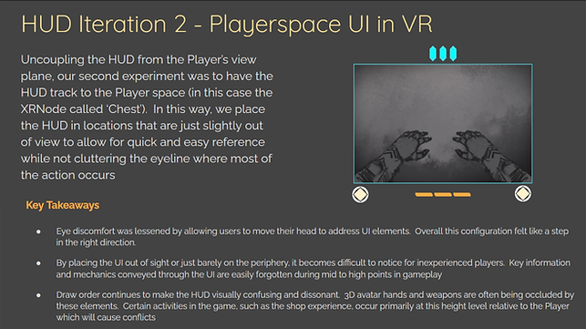
Variable Periphery Issues
Variable inter-pupilary differences, headset fittings, and whether a player wore glasses greatly affected the FOV of the player in VR. There were no 'peripheral corners' we could tuck UI in VR because every player had different corners.
Non-Euclidean UI Sickness
Affixing constant UI elements to the player vision caused severe optical dizziness and headaches for users. This effect was amplified by UI that forced Z-ordering to cause non-Euclidean layering discrepancies. This would often confuse the brain and cause users to feel cross eyed.
Diegetic UI was Cool... But Useless
The Bracelet HUD, Hand Gems, and 'Pip Boy' style user interfaces were neat uses of unique VR motion to check stats. They also frustrated players in combat as it was harder for them to quickly look at their wrists with their weapons in the way. Users hated accidentally "smacking themselves in the face" with their sword in VR.
Fight Mode Tunnel Vision
Players engaged deeply with the game developed a hyper tunnel vision fixated on the enemy in front of them. Specifically, the box of attention was the enemy's face and shoulders. We found a sever falloff of perception for anything outside of this area.
Embrace VR Magic
One impractical HUD approach inspired the eventual feature that allowed players to turn their palm up outside of combat to look at their weapon stats in each hand. This was one of those great VR UI interactions that just felt too good to not use! It felt right and it felt uniquely VR.
Production Development
Turning to Production, we were ready to commit to a set of UI features that were showing very positive responses from the team and our prototype playtesting arena. These features would be broken into two main categories: The Battle UI and the Combat HUD.
Production shifted our priority to creating polished existing prototype assets. We were also working in a rapid iteration cycle for game design systems and mechanics, with new needs or changes identified each sprint. As game design features were iterated on, I would work in lock step to make adjustments so that our UI features were telling the right story to players.


Combat HUD
'The Toolbelt'
The clear winner from our Preproduction prototype tests. The Toolbelt pattern was a set of hovering UI objects that formed an arc in front of the player at waist height.
This HUD tracked and followed the player character avatar and would lazy follow the Player's head turns. When they needed to check core stats like Health, Stamina, or Aether Powers, they merely needed to briefly look down to see them.
This system was immensely successful in testing. It was not intrusive, kept the eyeline clear during Combat, and was very easy to check quickly before squaring off with opponents again. It also avoided any overdraw issues by using a collider system to avoid obstacles and enemies that were close to the player.
Battle UI
Blocking and Dodging
A core selling point of the Until You Fall combat system involved a parry and attack pattern of play. Players must break their opponent's guard so that they can strike decisive blows against their foes.
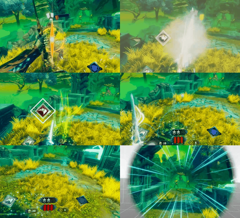
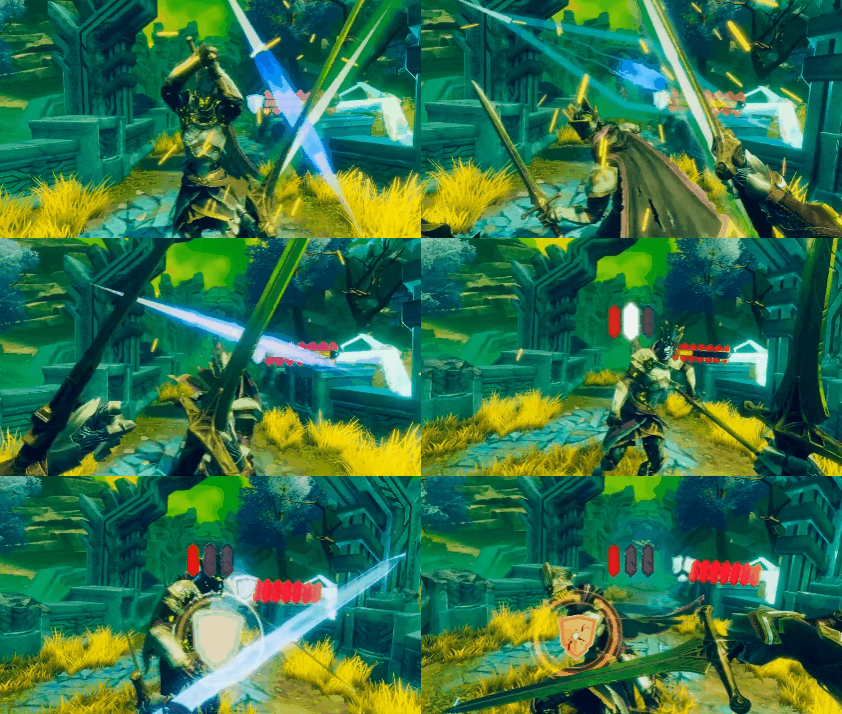
Blocking was utilized for attacks that players can parry. The player must align their weapon to the shown indicator before the enemy swings their weapon in order to deflect the attack. The quick read and juicy responsiveness allowed us to really string some spectacular block sequences to reward player mastery. It felt great when acing an enemy attack combo.
Dodging would be added later and was used for attacks that could not be parried. Players were required to physically dodge these attacks by leaning or ducking in the direction indicated. Because of the more complicated maneuver asked, these were usually single instructions and offered a large grace window to see the UI and complete the motion.


Battle UI
Critical Strike
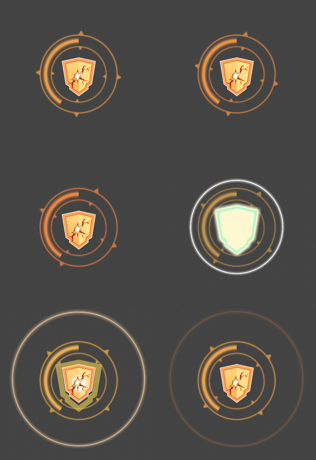
The Critical Strike UI was the indicator that let a player know that they could begin striking their foe for a critical combo. Each combo starts with a shield breaker followed by subsequent direction critical strikes that the player must swing through. The direction of the slash informs the player what the optimal direction of the swing will be that delivers the most damage.
This particular widget saw multiple iterations and revisions to help its visibility and how it called attention to itself when it appeared. Early versions were too subtle and players often failed to notice that it had appeared.
Once it was enlarged and positioned on the enemy chest region where users often had their eyes locked, it became an instant success. Players began swinging immediately without hesitation.


Combat HUD
Notification Barks
The Notification Barks became the term used for any of our widgets that were temporarily bound to the player vision to capture attention and elevate visibility to changes in the game state. We continued to layer these elements into the game over Production, iterating on their visual cues and presentation.
While some players reported these elements feeling obtrusive, we saw significant improvements for most users and tests with these elements included. Players were understanding how they were doing in the fight better and were employing their Aether Powers more often.
The Notification Bark system handled most of the game state messaging needs:
-
Player taking Damage
-
Player taking Special Damage
-
Player Aether Power Charging
-
Player exhausting their Dash Stamina
-
Player flanked by an Attacker
-
Player on Death's Door
For our final release we accommodated our super players by adding Options to turn off various Notifications as a Quality of Life. This would preserve the efficacy of these features for our new players and allow veterans to begin discarding game messaging that was unnecessary for their deeper experience.
UX Development
It was important to commit resources and effort to clearly establishing the vernacular of our product and its fictional world: Color Language, Graphic Design, Interaction Design, and Typography.
We wanted a cohesive and consistent experience for our users. From these established rules, players would be able to parse the information on the screen more quickly and with more confidence. This goes a long way, especially when guessing at how a new game mechanic may work!
It was an important exercise to revisit holistic rules of the experience and analyze where we weren't being true to those rules. In many cases, it helped us get to answers more quickly or spot problems before they surfaced in playtest feedback.

Color Confusion
In Early Access, these principles helped us to see the underlying issues of some core concepts. During iteration, a major combat design change made projectiles behave differently. Instead of needing to hit projectiles with your weapon (which was too difficult for most players) it was changed to just requiring the player to block them.
When the change went out to the community there was mass confusion. People simply did not get it. They flooded our Discord with bug reports and requesting help with how to actually succeed at this challenge.
Solution
I reviewed with the Combat Design team that our issue was likely caused by the color messaging on the projectiles. The projectiles had been implemented to use an orange indicator, which meant players were likely assuming the projectiles need to be hit (even if our tutorials and change notes say otherwise!).
Blue means "Block". I made a new version of the Critical Strike UI element with a blue version for this use case. Once the change went out, players found it to be immediately understandable and, most importantly, fun!


VR Inclusivity
Accessibility and Inclusivity were gaining momentum in 2019, but it was an especially difficult problem for VR. After all, VR is inherently inaccessible for many people because it is a technology that uses the player's kinesphere as one of its main selling points.
But we didn't have to accept being so exclusive. As the advocate for our players, it was my job to push us to be better. To make features that would allow more people to enjoy the game and make the game more enjoyable.
Features like Accessibility and Comfort helps everyone. It gives players options and lets them set the game closer to their preferences, often to the benefit of far more player profiles than the immediate problem being solved for.

"But what if this makes the game too easy?"
Sadly, a very common argument is that a feature may undermine the game design. This is where I believe UX is most important - When we are the voice for the interest of more than those in our team's immediate bias bubble.
To speak for those who use a wheel chair or crutches for mobility. Those with balance problems in VR. Arthritis, fatigue, or just a sprained ankle. The human condition is complicated and I was proud we chose inclusivity for those who wanted to try their hand at Until You Fall.
Seated Mode
During a playtest for the Dodging mechanic we saw a weird emergent pattern. Some people simply would not Dodge. Afterwards, one of them revealed to me that they simply could not do that motion. Their hips could not actually bend left or right to dip their head beneath the Power Attacks! So... they just let the enemy hit them.
Solution
Their story was not the only one as anecdotes shared revealed some aspects of the game assumed players were specifically abled. Seated Mode was a full feature built to remove this assumption from the game's formula. It greatly reduced the amount of expected displacement users needed to use to trigger successful actions. The added benefit was that seated mode also allowed players with smaller play spaces to also enjoy the game!
Seated Mode was far from perfect. Going with an alternate direction for the feature, some rough elements of the game remained for Seated Mode. Community feedback noted that elements like Dodging were difficult for them but showed gratitude for how much of the game was opened to them with Seated Mode.
No One Left Behind
As we neared the full release of Until You Fall, we were seeing some strange fall off numbers in our Tutorial section. Players were failing to complete the tutorial fights at all and eventually bouncing but it was a mystery to us why that would be.
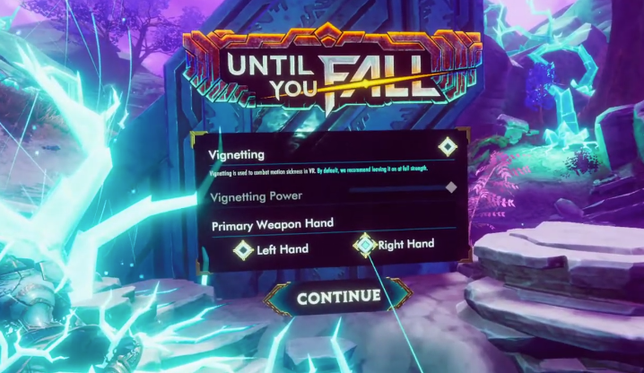
Then a player asked the pivotal question: Was there a left handed mode or did we intend to add an option for it? The tutorial was pretty tough without it.
Solution
Whoops! Our Tutorial starts the player off with weapons already equipped with the primary Arming Sword in the right hand and a Parrying Dagger in the left. The system did not allow the player to change this equipment while in a run, so they were stuck with it. It was possible to kill things with the Dagger, but it would be tough.
The emergency fix was to add a handedness selection before the First Time User Experience so we could equip the primary and secondary weapon accordingly. This stopgap feature was only necessary here, since the player freely chooses weapons with whichever hand they prefer for the rest of the game.
Final Product Outcome
Until You Fall launched as a full release in 2020 for PC VR, Playstation VR, and the Oculus Quest. Until You Fall remains a critical success with an Overwhelmingly Positive rating on Steam and nearly 5 Star aggregate review on the Oculus Store.
Our title was regularly reviewed as a huge leap for VR melee experiences. Personally, it was incredibly exciting that we received an accolade of Excellence in User Interface from the Road to VR team.
Our intent was to build a product that offered a compelling rule based combat system for exciting melee combat in VR. We wanted our players to feel like weapon masters and see their power grow as they persevered against the monsters of Rokar. Our community's feedback and enthusiasm has shown a real love for Until You Fall and how it tested their mettle in VR!