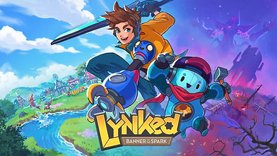
Lynked: Banner of the Spark
Case Study
Development Studio - Fuzzybot Inc.
Publisher - Dreamhaven
Lead Senior UX Designer
3 Years 1 Month
About this Case Study
This presentation is a longer form discussion of my work on Lynked: Banner of the Spark. It is intended to help with laying out the problems we were tackling, my thought processes for our UX strategies, and reflections on the outcomes of the project. It traces the full arc of a 40-month project, from a rough alpha to a six-platform release, focusing on the UX decisions that shaped the journey.
By the end, I hope this will give you a better understanding of how my grey matter likes to ingest problems, process information, and produce solutions with the various tools and approaches that define design thinking and user centered design philosophy.
01. Project Overview
What I Did
Lead UX Design
Game UX and System Strategy
UX Research and Playtesting
UX/UI Development UE4
Inclusivity Advocate
Learnings
Hybrid Genre UX
Audience Alignment
User Centric Iteration Cycles
UX Strategy for PC and Consoles
Outcome
Early Access Release Oct 2024
1.0 Launch May 2025
Steam, Steamdeck, Xbox Series, Playstation 5, Switch, Switch 2
Positive Reviews, Low Sales
The Problem
Fuzzybot was ready to change gears from the exploratory preproduction phase to a shipping mentality. The project was ambitious with a large scope wish list, huge content inventory, and a vision that the studio would "punch above its weight class". The expectations set a high bar for what was to be completed with the remaining development time.
Fitting 2 Genres in the Scope of 1
Cozy Life Sim and Action Roguelite are both feature heavy genres and our keystone references were often drawing from exalted success stories. The team's wish list when imagining a Rogue-Life was lofty as a result.
But the reality was that we couldn't make Hades and Animal Crossing. The math of our team size and runway to release required informed compromises on what we could build.
Hybrid Genres, Diverse Audiences
We imagined that we would get some amount of market capture from both Roguelite and Cozy Life Sim enthusiasts. But it was a thesis with scarce data or market research to inform us of what these audiences wanted.
A likelihood was that the combined audiences would have unique preferences, needs, and expectations. How our game landed with these players would be a defining research challenge of the project.
03. My Strategy
To punch above our weight class, we needed to know what to swing at. Time and resources would be tight, so picking smart targets with high appeal was vital. Our goal would be to take our critical features and assemble the Minimum Viable Playable and get it into the hands of players. From there, we'd have a working test bed to understand if our punches were really landing with our audience.
To begin, I pressed our creative leadership to define an anchor ratio to guide our foundational product decisions. We considered the game's fun and content would be 70% Action Roguelite and 30% Cozy Life Sim to capture interest in the important player demographic: Action Roguelite Players. This would help us frame our mental model about our game, its holistic vision, and help set a concrete starting assumption for the playbook I would be running.

70% Action Roguelite
Hades

30% Cozy Life
Animal Crossing

Understanding the Project
Assess where the project was starting from today and specifically where it wanted to get to. These answers would be our map and help us navigate which way took us 'forward'.
-
What features currently exist as designed in Preproduction?
-
What features and game loops are unaccounted for?
-
What Action Roguelite features get us a Minimum Viable Playtest?
-
What Cozy Life Sim features get us a Minimum Viable Playtest?
Understanding the Player
Identify what was vital to our audiences' taxonomies of fun. With scope cuts looming and a reprioritization to shipping, it was imperative to know which cuts could send us 'backward'.
-
What do our players think of this unique blend of fun?
-
What does this audience expect the game will be?
-
What does this audience hope the game will be?
Understanding our Constraints
2 years to complete this game was not a lot of time. This was a development timeline that required us to spend wisely. I sought to cull our scope as much as possible up front to give us more room for polish and iteration.
-
What can we confidently cut now?
-
What can we change to make our ambition achievable?
-
What can we shift into the Live Service long tail?
My Playbook
Build Empathy
UX Discovery and Audit
Prototype MVP Systems
Player Validation
Full Production
Release and Beyond
04. Building Empathy
I started a research exploration to construct my own empathy model through the lens of the player. Plotting conceptual mind maps of how I naively understood core systems, how they operated under the hood, and how all of these major systems came together as the player journey. Early exercises and design conversations were essential to on board myself with the game holistically and understand exactly where intent and execution existed.
Fig - Naive Team Testing. Rose, Bud, Thorn exercises and Clustering


Fig - Mind Map Modeling to understand systems and player motivations


Competition Research
I selected 4 titles commonly referenced in our design conversations, played through each, and journaled the end-to-end experience. Having a firsthand personal perspective gave me a more sophisticated grasp of their systems and presentation. This provided context during deeper system design conversations and allowed me to draw upon comparisons to our own goals for any Minimum Viable Playable.
Each title also had established communities built around them from which I could glean insights about player perspectives and sentiments. This data helped with our competitive comparison and a MoSCoW priority of Must Haves and Should Haves in proposals for a Minimum Viable Playable.
Fig - Player Persona Workshopping from sampled communities


Curse of the Dead Gods
Highly Referenced by Design
Action Rogue-Lite
Deeper Combat Mechanics
100% Action Gameplay
+ Advanced and Heavy Combat System
- Very Slow to Master
- Repetitive Long Gameplay Loop
- Cool Concept, Lackluster World

Hades
Highly Referenced by Design
Action Rogue-Lite
80% Action Gameplay
20% Cozy Life Sim
+ Sophisticated Fluid Combat System
+ Very Fast Game Loop (avg. 30 min)
+ Powerful Dialogue and Narrative
+ Deep Character-centric Growth

Cult of the Lamb
Closest Competitor
Hybrid Genre Action Rogue
60% Action Gameplay
40% Cozy Life Sim
+ Simple but Intuitive Combat System
+ Masterful Pace of Progression
+ Simple but Charming Narrative
+ Compelling Aesthetic Juxtaposition

Animal Crossing
Highly Referenced by Design
Cozy Life Sim
Deeper Life Sim Mechanics
100% Cozy Sim
+ Compelling Daily Play Pattern
+ Well Paced Content Activation
+ Simple Gameplay, Instant Flow
- Clunky Multiplayer Systems
Fig - Alpha Playtest Metrics Summary

Alpha Playtest
In October 2022, we conducted an extensive UX research initiative targeting a cohort of 500 players. Signups were sourced from communities interested in Roguelike and Roguelite titles, Cozy gaming communities, and tester referrals.
I prepared a written survey to gather data from volunteer respondents using questions specifically about NPS, Product Reaction, and Friction. This combined with our own metrics collection and an active Discord channel to give us a snapshot of our different user groups in our audience.
Fig - Alpha Playtest Sample Survey Data NPS and Product Reaction Tests


Key Observations
Accessibility and Customizability Expectation
Users required ways to adjust user interfaces and gameplay options and felt it was industry standard to have them on offer. These features would have high value given their investment.
Tutorialization and Guidance Expectation
Players found themselves lost without a traditional guidance system in the demo. Players wanted more help understanding what they could do and reminders about where they were supposed to go.
A Ghost Town
Players found the Town experience and 'Cozy' side of the game shallow in its current state, with one person calling it a "Ghost Town". There simply was not enough to engage with to feel like a Rogue-Life.
Divisive Combat Feedback
Many of our players were exasperated by the difficulty of the demo. They saw combat as unforgiving and player powers were weak. For them progress was nearly impossible when they hit main skill gates.
In an opposite camp, players felt the game was simply too easy, slow, and lacked depth. They perceived the game as boring because it didn't challenge them. They felt they solved the game too quickly and overcame our major skill gates without much effort.


Danger Signal
Anecdotes about difficulty, fairness, and punishing combat mechanics specifically drew my attention. They contradicted our super-player sentiments believing the demo challenges were "too easy" for the Action Roguelite players we were marketing to.
But was it "too easy"? The gathered metrics data from the broader audience told a different story. It was clear that a large portion of people were already struggling with the difficulty of this genre blend. Many players were also unaware of the core Roguelite tropes of frequent deaths and iterative failures to reach victory. For them, dying many times was frustrating rather than just part of the fun.
A tension emerged between two of our player personas, with one group hoping to test their mastery while the other warning us that their tolerances for such tests were low. Two large player groups with dramatically different taxonomies of fun and very different expectations from a Rogue-Life.
Playtest Conclusions and Risk Assessment
We understood what our primary fans were enjoying about the Cozy Roguelite, but major needs were not being met for many of our secondary audiences. Failure to properly account for these players' preferences provoked a pressure of negative sentiment.
This showed in our Net Promoter Scores. A majority of our players occupied the Passive range, but it was concerning that 25% emerged as Detractors pushing enthusiasm down about the game and reflected a direct risk for a successful release.
But at this phase we were stuck in a difficult situation. We understood these opposing sentiments in our players, but were hesitant to make any pivot with the game in an incomplete state. We anticipated that the planned design would already remove these barriers for secondary audiences. If they did not, we accepted the risk that a casual leaning demographic would likely bounce off.
9 - 10
Promoters
32%
7 - 8
Passives
43%
Detractors
25%
1 - 6
05. UX Audit and Discovery
The 'Life' part of the Rogue-Life was underdeveloped. This constituted nearly all the player decision points in the metaphor for meta progression. Many of these systems were placeholders or outmoded, meaning that much of it would start from the drawing board.
At the same time, existing work in the Preproduction project needed organization and structure. Major design revisions were occurring and many systems were being scrapped for a new project spec. So, plenty of work there as well.
My immediate priority was to inventory features and categorize them with MoSCoW. Anything structurally important in marrying the Cozy Life Sim and Action Roguelite were our Must Haves. These keys would stand up the Minium Viable Playable for a functionally testable outer game loop.
Fig - Screen State over Time Graph and a categorized features inventory grouped to systematize known feature needs


Our Objectives
We had our findings and research to move forward with a set of priorities. These were my most fundamentally important UX objectives set for Preproduction. I believed these would get us closest to our Minimum Viable Playable which, in turn, would allow us to begin getting actionable playtest feedback from our community.
Guide Players to the Fun
We would build better systems to remind players of motivations and help them achieve their goals.
Get Cozy
We would pick our own 'Cozy mainstays' and fit them in the hybrid game to fulfill our promise of a Rogue-Life.
Give Players Power
We would build tools and weapons to give players the edge in combat and help our players find these keys to power.
Customization for Inclusion
People need technology to adapt to their needs in modern games. We must build those systems now. Or feel pain later.
Build Efficiency
The most important objective was shipping the game. The project scope demanded strategic development efforts that were reusable and efficient.
06. UX Pre Production
My remaining time for Preproduction was about velocity to achieve our ambitions. My process boiled down to defining the game design specs, thumbnailing and wireframing solutions, translating the gray boxes into usable wireflows, and finally working alongside engineers to build working prototypes in Unreal 4 UMG.
Emphasis at this stage was on functional interfaces rather than polish. I wanted to get ideas and systems into a demonstrable proof of concept quickly. My goal was to leverage our closed public community volunteers as much as possible, allowing them to engage with these prototypes and furnish feedback about playability.
Fig - Defined UX Design Pillars, derived from the Game Design Pillars of the Project


So... What did Preproduction look like?
Gathering Design specifications and constructing Flowcharts to visualize player activities, gameplay sequences, and feature behaviors.


Sketching Thumbnails and Storyboards to ideate concepts with the team quickly and move forward with promising approaches.


Hardening concepts into graybox wireframes for User Interface features, screen layouts, and HUD elements. Defining what information we need to show, where to show it, and how players can access it.


Building Wireflows to showcase intended feature functionality with sequential wireframe states. Mapping out Interaction Designs a player would use to navigate and engage with these UI features.


Documenting feature details and design needs for team reference as we began planning and building the systems architecture within Unreal


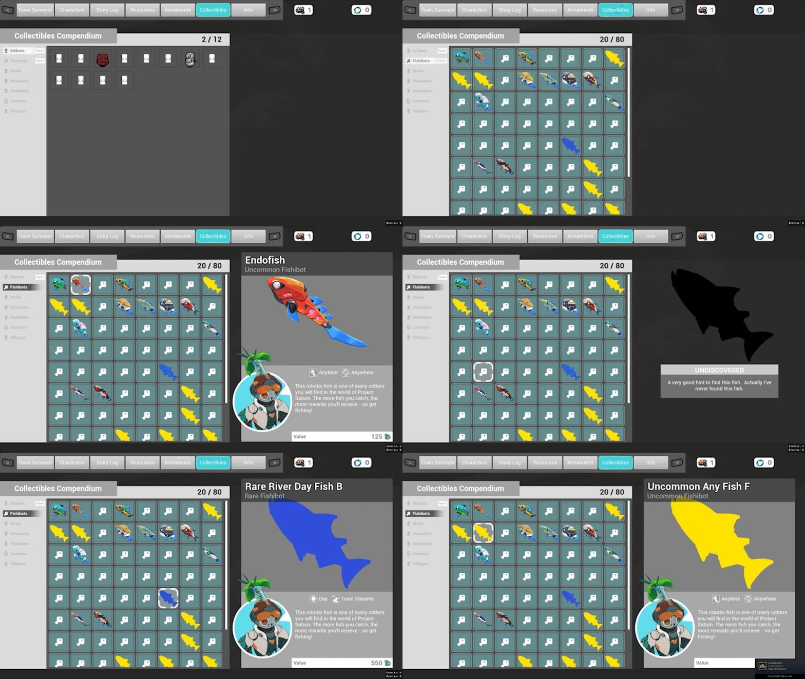
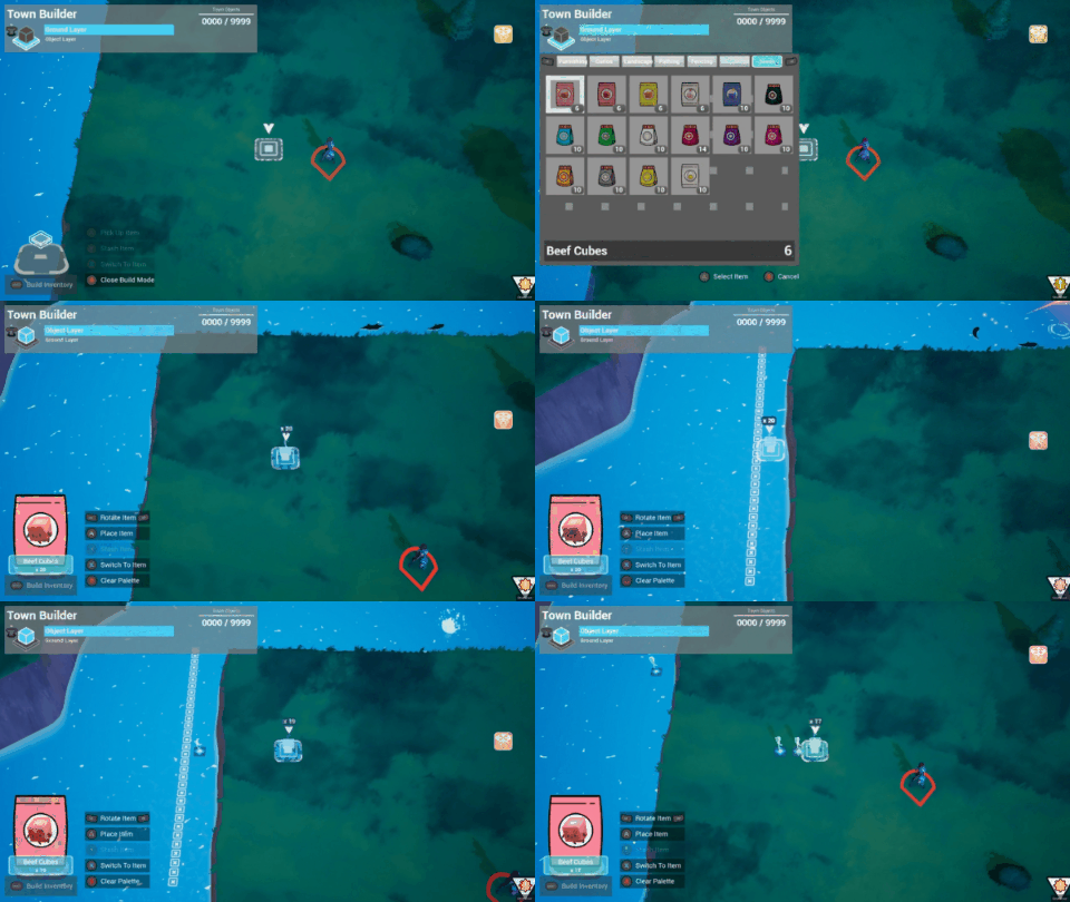
Build the playable Prototypes within Unreal using UMG. Test with the team internally and get ready for our closed public volunteer playtest protocols.
Player Testing and Iteration
Prototypes were built with UMG to test on panels of playtesters each month. I prepared specific protocols intended to analyze playability heuristics and gather player sentiments about features and game loops. This was a combination of both the usability of these features along with their desirability in the context of the game.
Iterations were prioritized based on how common certain clusters of feedback were observed or reported by testers. For our tests, I color coded individual player feedback to help us understand how sentiments were distributed across the testers.
Feedback common to all players in any given playtest was given the most weight for iteration priority.
Fig - 3 User Playtest Sample: Gameplay Recording and Player Commentary Notes

Building Efficiencies
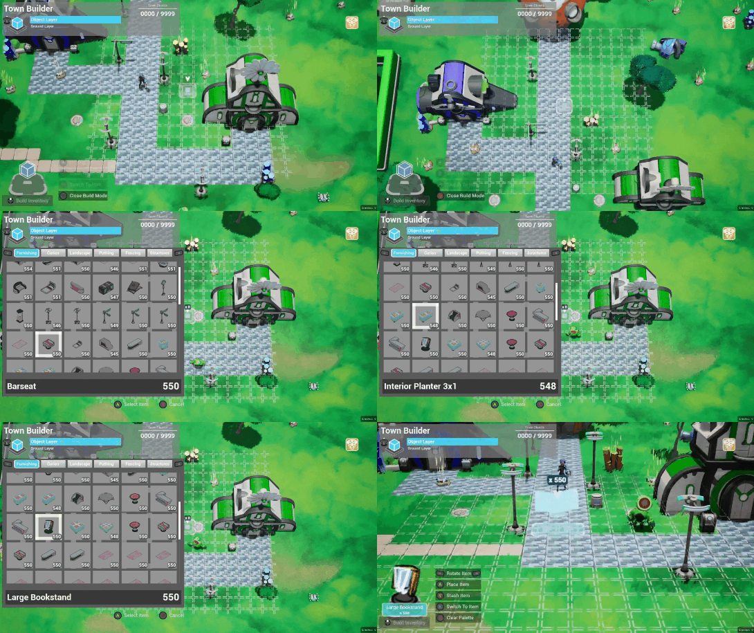
How could we fit all of this work in our timeline and with our team size? With the sheer number of screens and features identified during the UX Audit, it was clear that bespoke screen designs for every feature was out of the question.
With a systems heavy design, it was better to approach it with systems thinking strategies. Collaborating with our engineering group, I categorized systems that required similar player activities, content, and information presentation. With this we consolidated features to use common structural patterns and a set of universal widget templates. Building in this way would allow us to create many interfaces with modular screen widgets and configuration data.
Fig - Modularity showcasing Templates coverage for various feature groupings


07. Full Production
In Production, the remaining scoped work required a strategy change for the UX group to get to shippable and polished. We scaled the UX team to add 2 Senior Designers and 2 Engineers. I transitioned to the UX Lead position where responsibilities expanded to include team coordination.
I was assessing our holistic product priorities, planning sprint objective assignments, evaluating feature performance, and triaging bugs and feedback arising from completed work. I also served as the point person for UX issues for our vendors porting and optimizing the title for console releases on XBox Series, Playstation 5, and Nintendo Switch (and eventually Switch 2).
My design cycles were spent building out screens for the primary gameplay systems and product level features.
Front End Menu System
Title Screen and Login
Save and Load Data
Multiplayer Sessions and Lobbies
Game Options System
UX Utility Widgets
Transitions and Loading Screens
Gameplay Screens
Item Shop Interfaces
Crafting Shop Interfaces
Weapon Upgrades and Modifications
Seasonal Shop Systems
Mission and Contract Select Screens
Player Skill Purchase Screens
Combat and Town HUD Widgets
Product Level Systems
Localization Support with Gridly
Multiplayer Modal Change
Pause Functionality
Controls Mappings
Accessibility Settings
3rd Party Console Support
(PS5, XBox Series, Nintendo Switch II)
Front End Menu System
I was responsible for the full Front End Menu system and utility widget systems related to handling meta application features. This included all of the screens and features including the Title Screens, Saving and Loading, Multiplayer Game Screens, and Options Menu.

Live Service Taboo
Players were skeptical of Lynked being an 'Always Online' game with data exclusively stored on the cloud. With high profile demonstrations of live service games failing their customers, requiring a connection to Dreamhaven servers was a hot button topic that withered trust for our new brand.
Solution
To address this unpopular restriction we needed to scrutinize our product strategy. Its unpopularity gave us the impetus to build an Offline Mode and a local data storage system. Allowing the players to have more open access to their own save data was greatly appreciated and assuaged fears about our intentions.

Is My Town Safe?
Lynked's Multiplayer System was promoted enthusiastically by players but had a reluctant adoption rate. Players often reported a hesitancy that their Towns could be harmed by others if they opted to Host.
Solution
We added features for players to fully gate their Towns. A specific Join Code that the Town Host would share with trusted players was required.
Permissions Rules let Hosts restrict players from certain actions in their Town. This allowed Hosts to invite new people or strangers into their Towns without fears of damage from bad actors. Visitors could only modify the Town if they were allowed.
Both features helped players feel more in control with how other people could interact with their Towns. This facilitated more ways for players to connect with less assumptions about how they should play together.


We need more Options!
One of our biggest requests was Accessibility Settings, Controls Mapping, and Gameplay Customization. These fundamental experience features were built with the modular Options Widget System I designed and implemented with our Front End engineer.
Our robust and easy to add Options helped immensely with quick iterations and additions based on community identified pain points. Some of the biggest issues included:
Yes! We Need Mouse and Keyboard
At first there was speculation that we could forgo Mouse and Keyboard support. Playtesting showed that was a recipe for disaster. Building Mouse and Keyboard as a well designed input pattern with supportive options was extremely important.
Button Remapping is a Must
One of the most important Accessibility options for us to provide was button remapping for any supported input configuration. This was highly requested and very appreciated as a launch feature.
Comfort for All
We had great quality of life features to help make the game more playable for more people. Gameplay options and preferences helped make the game more friendly and customizable.
Screen Shake, for instance, is a wonderful immersion trick right up until someone becomes so nauseous they have to stop the playtest.


Multishop Template System
The final result of Multishop allowed this template system to cover a total of 24 separate game features. This saved us time on Iterations and debugging in the later stages of Production. We squeezed usage out of the system for its intended uses and even pushed it to do cover unexpected features as the game evolved. This allowed us to implement new features in the final phases of the project without significant costs and even test some implementations for systems that would require a selection and purchase step.
Tradeoffs
Calling the Multishop System a 100% success would not be accurate. The price for its modularity and ability to enable designer side creation of shop and crafting interfaces was that it had its weaknesses.
The biggest tradeoff was in the usability of the tools needed to author Multishop interfaces. Managing the data assets needed to create a new shop was involved and errors were hard to diagnose. Regularly this was a frustration for myself and others as the project got larger and content exploded.
It was also difficult to mutate it to solve new problems as production continued with iterations and changes in the game design. Deviating from the set rules that the initial widget system solved for was often more involved and had knock-on effects for other screens.


Banner of the Spark
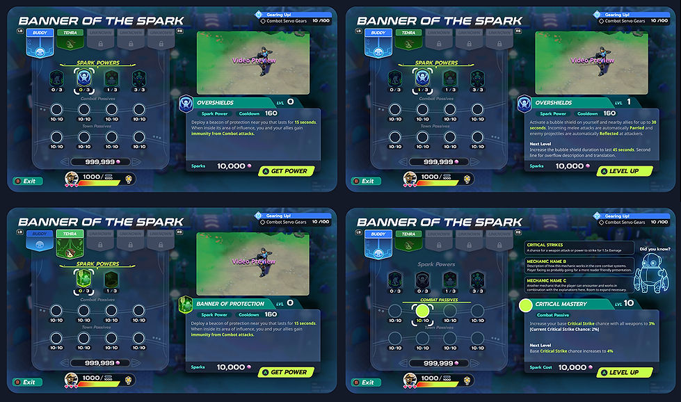
The Banner of the Spark was one of the most important keys to Player power in the entire game. Through this interface, players gain new signature Spark Powers as well as major boosts for their combat stats and Town activities by spending Soulsparks.
As such, we were able to dedicate more time and polish to this screen to help it stand out. The desired goal was to make the screen feel specially unique and, thus, call attention to itself as being more important to the player.
08. Early Access and Launch
Risks about the game's readiness and market positioning led us to delay our release and target Early Access in October 2024. Though it was not ideal, I felt it gave us the best chance for our launch.
I am an ardent proponent of the player centric development advantages that Early Access brings. It was our opportunity to see how the title resonated with our actual audiences and helped focus our efforts.
Early Access Reception
The game's debut on Early Access told two stories. Reviews and ratings were very positive and the community engagement was exciting from our Promoter players. We had achieved many of the objectives that we had set for ourselves since the early public playtest 2 years prior.
But the funnel numbers were not exciting. Conversion rates for store page visits to sales were lower than estimated and we had higher than normal refund ratios. Compared to adjacent competitors releasing in our sales window, we were underperforming.
Early Access Audience
We were aiming for Action Roguelite players but it became clear that our primary audience was more casual than theorized. These casual players felt invited by the vibrant whimsical art style, playful tone, and intriguing hybrid genre pitch. The emergent demographic, which we called our Lethal Cozy players, were equally compelled to build their towns and overcome the challenges of battle. They showed the most engagement with the title but also struggled with the combat skill gates.
And that fact showed in the numbers. High dropoff rates coincided with high failure percentages on early combat missions. Our challenge curve was steep and assumed a certain Roguelite savvy, making it a wall for many players approaching the game unfamiliar with the genre.
On the opposite side, our Action Roguelite seemed less invited by the marketing pitch. Those that did purchase also had many notes about the game with regards to its pacing, feel, and overall presentation. In opposition, this group was finding the game somewhat boring, repetitive, and tragically grindy. This was the bad news.
Early Access Last Pivot
With the dwindling time and resources we had available, we made a few final course change features in an attempt to help bolster our Lethal Cozy players and give our Action Roguelites more challenge.
The most dramatic of these changes was the Buddy Up Update, which constituted a huge scope change to add AI controlled NPC Battle Companions. These companions were meant to replicate the advantages a Multiplayer team had in the game and offer a crucial difficulty mitigation for our audiences.
We saw marked improvements in our success metrics with this update implemented. We hoped that it would turn into big impact changes as Lynked readied to exit Early Access.


Accessibility and Customizability
Mouse and Keyboard support, Button Mapping, Difficulty Options, and Comfort Settings cited as important inclusions.
Tutorialization and Guidance
Onboarding to the game was clearer and the core loop of the title better understood. Fewer reports of users feeling lost.
A Lively Town
Town now had a wealth of activities and systems to engage with. Often cited as some of the strongest content and enjoyable activities.
Divisive Combat Feedback
Improved but conflicted reception. For some, a challenging and punishing game. For others a repetitive slog that felt shallow.
Bugs and Performance
The UX nightmare of a game with performance issues, networking problems, and gameplay bugs. This was a new major headwind for us.


Steam Achievements at launch reflected our metrics on survival funnels and these helped with quick spot checks of our player base progress.
Only 9.4% of players were able to reach and defeat our first Boss in Logwood Liberated.
For context, this percent of players is close to the ratio of players completing Getting Over It with Bennett Foddy: A 'masocore' title notorious for its extreme difficulty and frustrating mechanics.
1.0 Launch and Live Service
In May of 2025, Lynked: Banner of the Spark went live on Xbox Series X/S, Playstation 5, and Steam and our team switched into a Live Service development mode.
Difficulty Settings would be our main new assist feature going into the full game launch to offer a less lethal balance to players that wanted something easier. Anecdotally it helped but did not move the needle for our 1.0 Launch audiences in the subsequent months.
Our last update after launch was the Switch 2, using the excitement for the system and Nintendo's promotional blitz to help our momentum. After the release on Switch and Switch 2, it was decided to end the project. Active support and content development was wrapped up in a final stability patch.


09. Title Performance and Outcome
Lynked was released on Steam Early Access in October of 2024 and had a 1.0 launch release in May of 2025 on PC, Xbox Series X/S, and Playstation 5. In September 2025 we released the Switch and Switch 2 versions of the game on the Nintendo marketplace.
Unfortunately, Lynked: Banner of the Spark did not hit the sales targets necessary for its investment. Momentum was slow on Steam and the 3rd Party Console marketplaces. The reality was that our studio had to downsize significantly to remain operational. My position would be among those that was necessarily cut as the studio scaled down.
So what was learned?
Lynked sought to appeal to two vastly different audiences but struggled to sell itself to either. Our sweet spot was in the Venn intersection between the two, with players that liked cozy gaming ritual and demanding combat challenges. We called this niche our Lethal Cozy players.
This Lethal Cozy audience did thoroughly enjoy what we offered. Review ratings on Steam were strongly at 80% Mostly Positive and that reflected on the Playstation Store with a 4.5 Star rating. Our players regularly praised the title as a 'hidden gem' that struck the right balance between action and relaxing gameplay.
But this had not translated into success for our project or our launch and that was what I most reflected on in the aftermath.
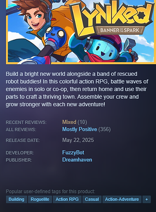
Missing Our Primary Audience
Its clear Lynked appealed to the intersection of Roguelite players and Cozy Life players. These Lethal Cozy players were excited but sadly represented a small percentage of both audiences. Too small to carry the project alone.
We had accepted the risk that we may miss our key audience early on. But critical hindsight shows that we spent big on features for our Cozy Life Sim player persona when our primary audience was the Action Roguelite player. This miscalculation may have made the game skew casual and amplified our risk severely.
Going Too Wide
From the start we wanted to "punch above our weight class". That framed the story about the scope of our project, the time and resources we had, and how thin we would get stretched.
Many of our strategies helped us squeeze in more features and content with certain tradeoffs. But that extra effort had proven unimportant and the tradeoffs had distracted us from the foundational fun for our core audiences. A better answer would have been to refocus on making the game do a few unique things very well.


Shipping is a Win
I was proud of the team and their monumental efforts to make Lynked a reality. In the course of 40 months, we were able to take a rough and ready prototype to an Early Access launch and subsequent Full Release on Steam PC, Steamdeck, Playstation 5, Xbox Series X/S, Nintendo Switch, and the Nintendo Switch 2. We got it to the finish line and that is an achievement. Not all game development stories get to end on that note.
For me, this development cycle had reinforced many UX design lessons and let me reflect on its value in the craft of game development. Creating games is probably one of the most challenging creative pursuits and every new project is an opportunity for me to learn, adapt, and carry those experiences forward to new projects and challenges.
Most importantly for a player centered designer like myself, it is cheering to know that thousands of people delighted to play in the world of Lynked and many truly appreciated the fun to be had in the day of a Cozy Rogue-Life.


